Lumé Skin
Illustrative Case StudyA clean beauty founder had the product. We found the story and made it feel like luxury before the first sale.
The Situation
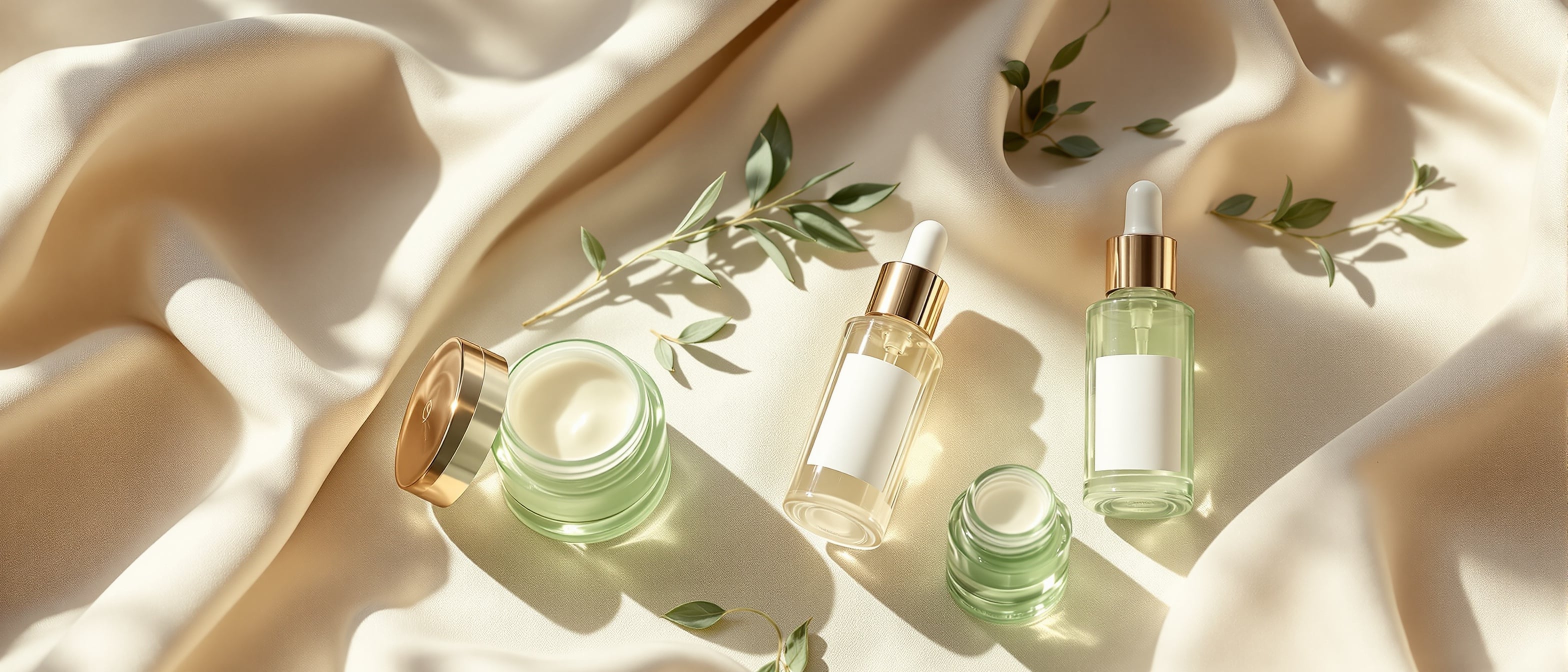
Lumé had a hero serum, a small founder team, and a vision for clean beauty that was not loud and not preachy. Just real. They needed to translate that feeling into something a customer could pick up and immediately understand.
The Problem
The product was right. Everything around it felt borrowed. The visual identity, the voice, the packaging, the way the founder talked about it. Three different languages trying to be one brand.
The Work
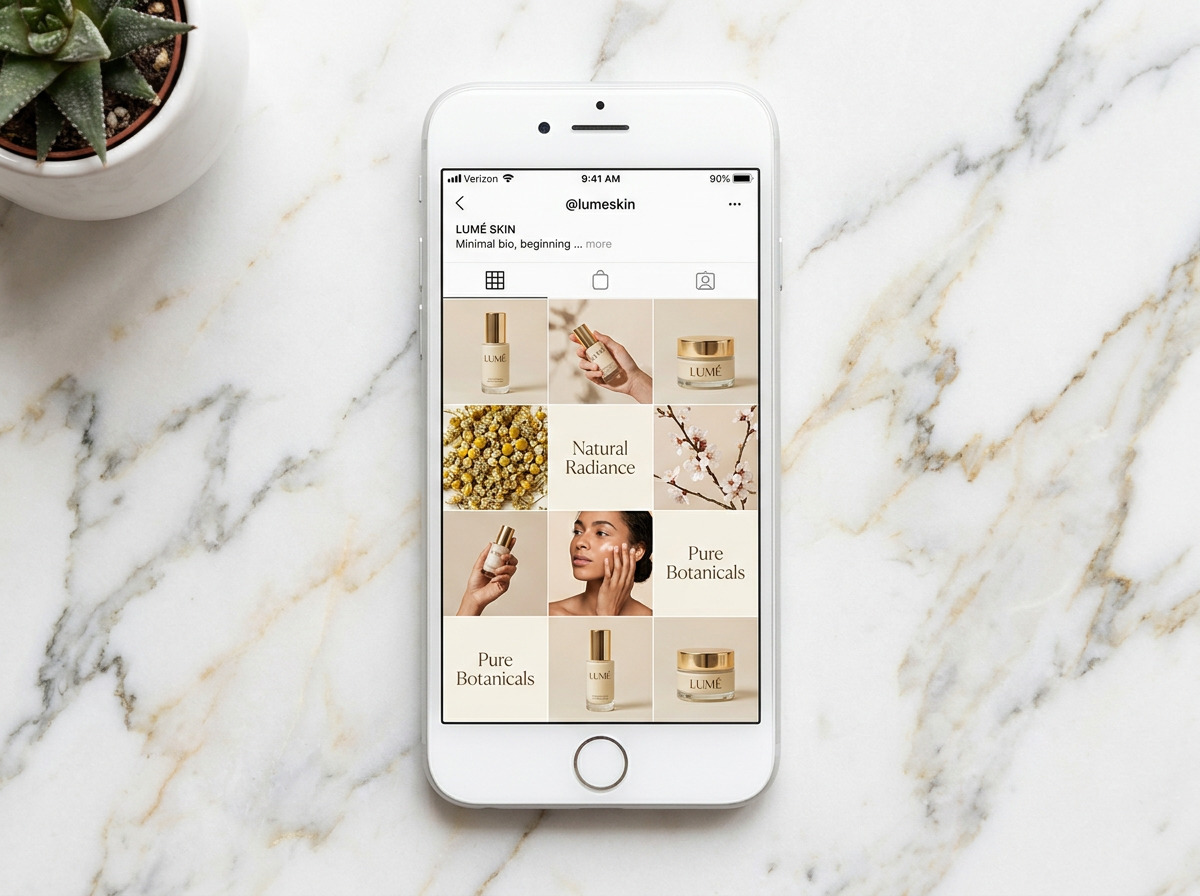
The Approach
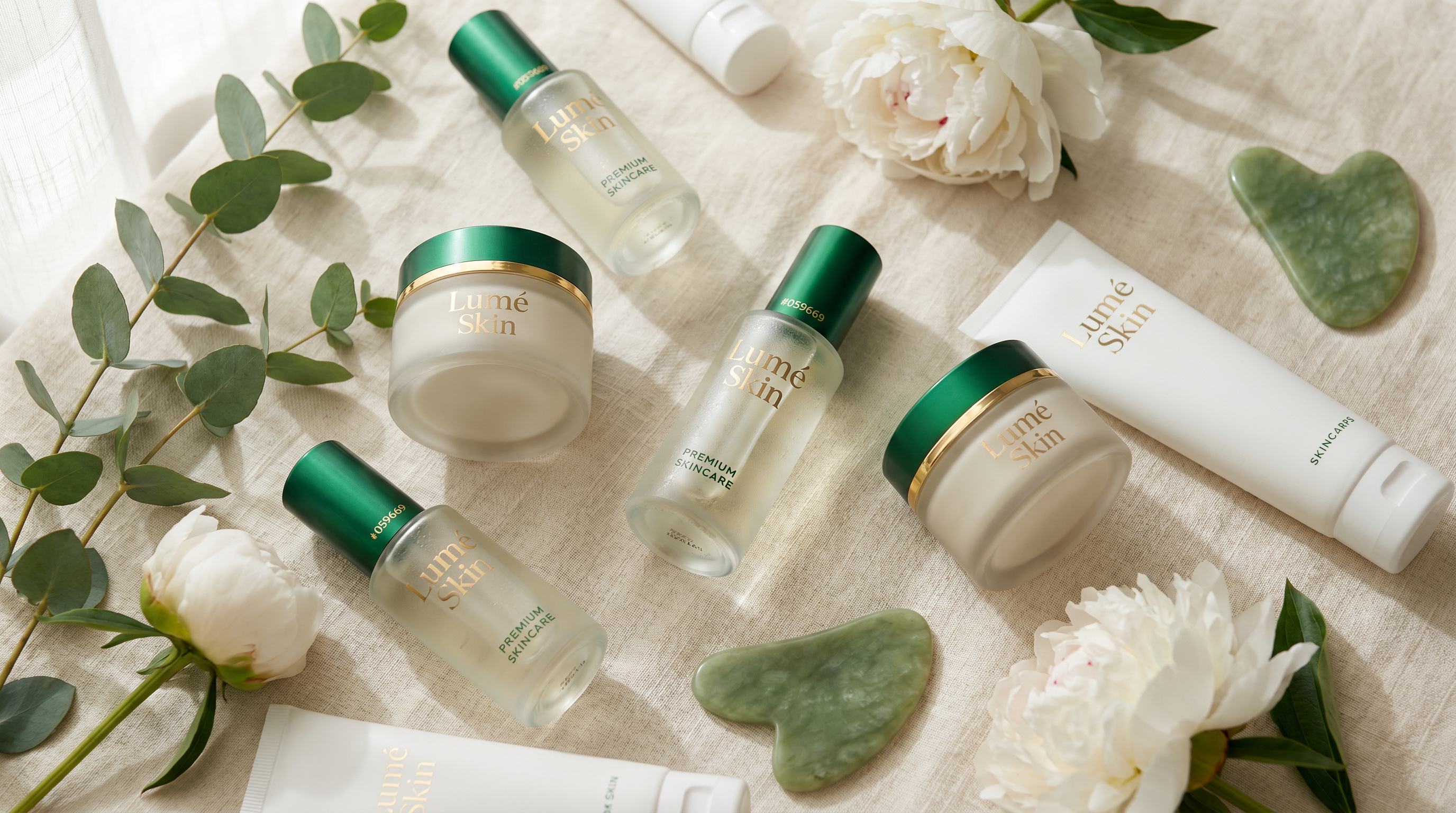
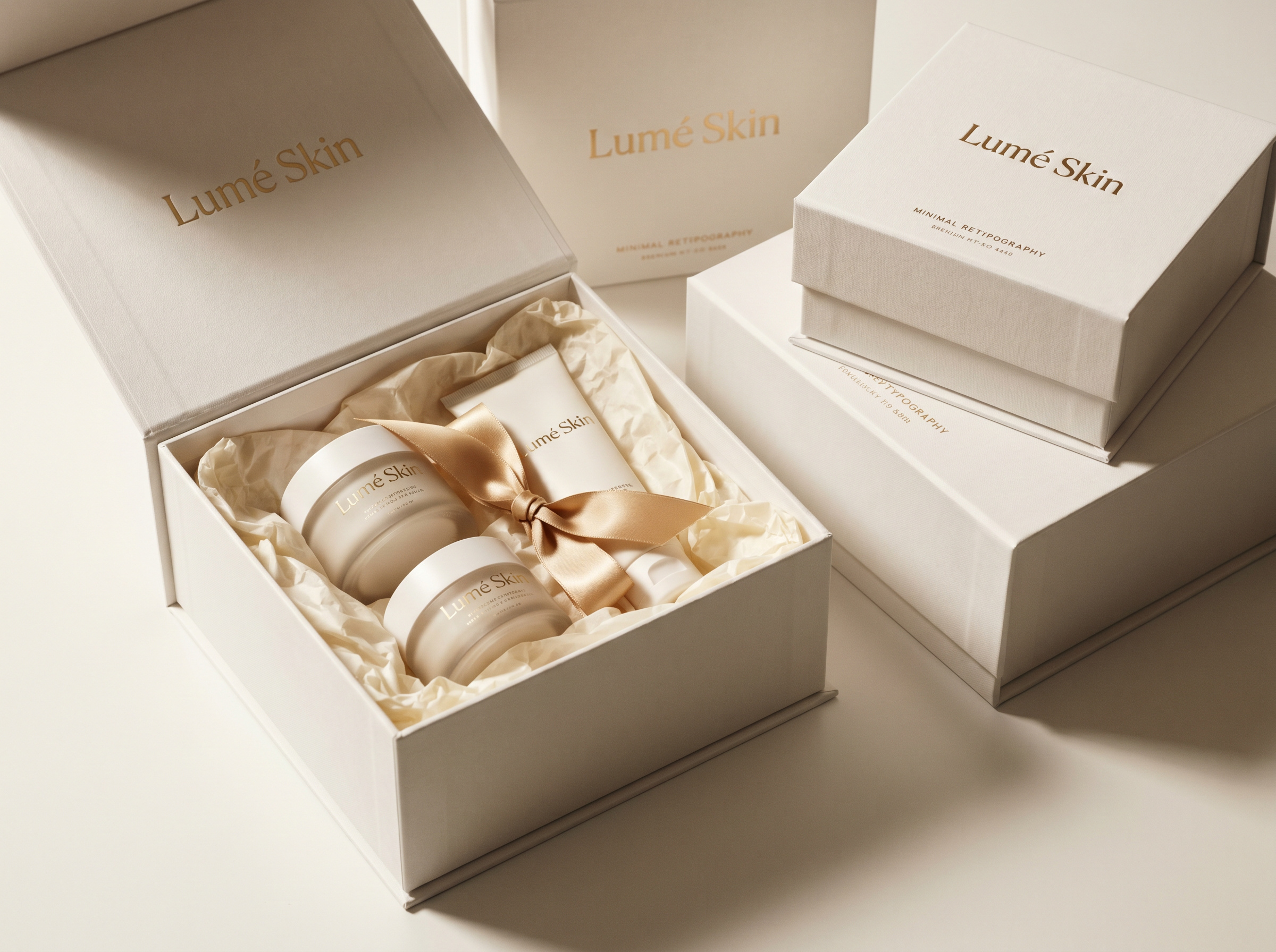
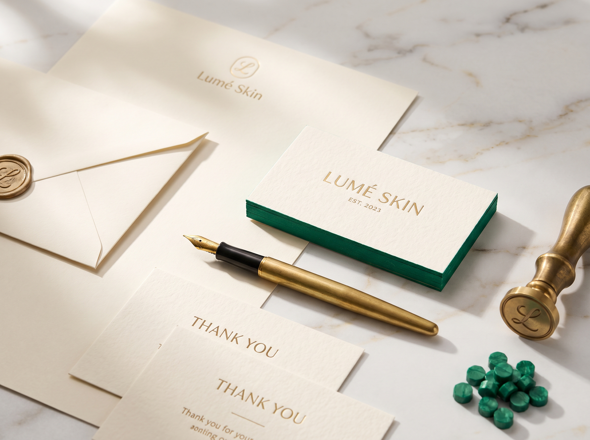
We led a strategy intensive to define the emotional core in one sentence. From there we wrote the voice, designed the identity, redrew the packaging, and built a launch system that the team could run without us in the room.
The Outcome
A complete brand that felt premium from the first impression. The kind of brand that gets reposted by customers without being asked.
What Changed
4x
Press mentions in launch quarter vs. plan
92%
First-batch sell-through
1
Voice the whole team can write in
A brand that felt like a luxury product before the first sale was made.
“They did not just give us a logo. They gave us a brand. There is a difference and CDH knows it.”
Priya Anand · Co-Founder, Lumé Skin